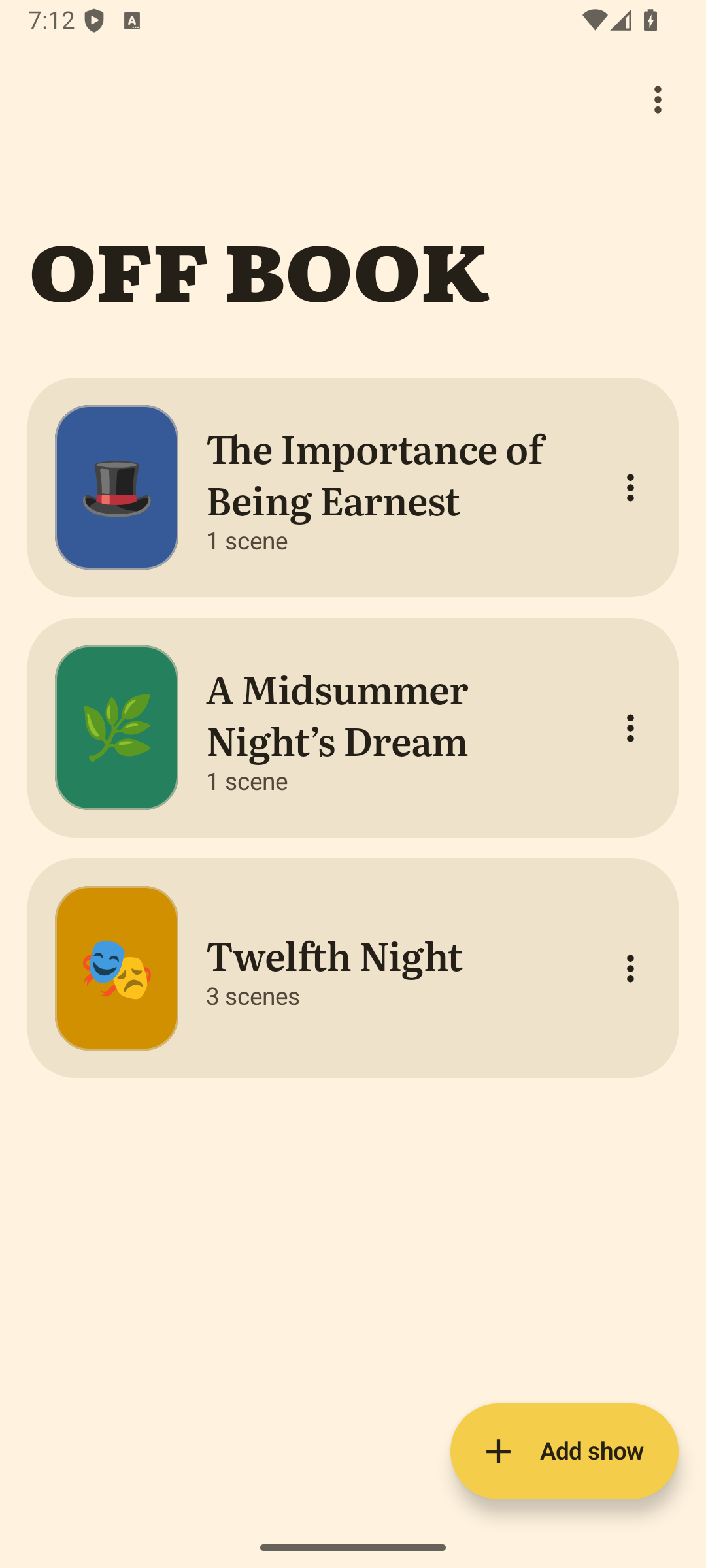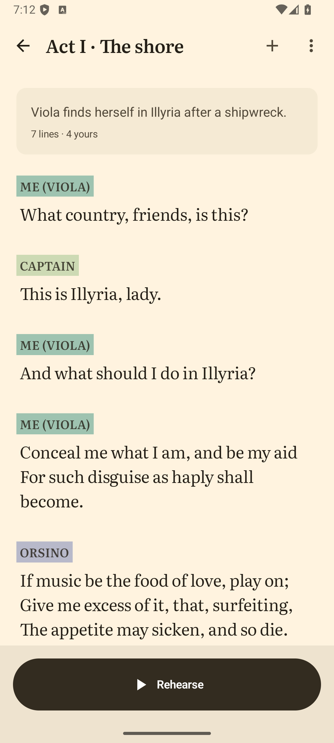
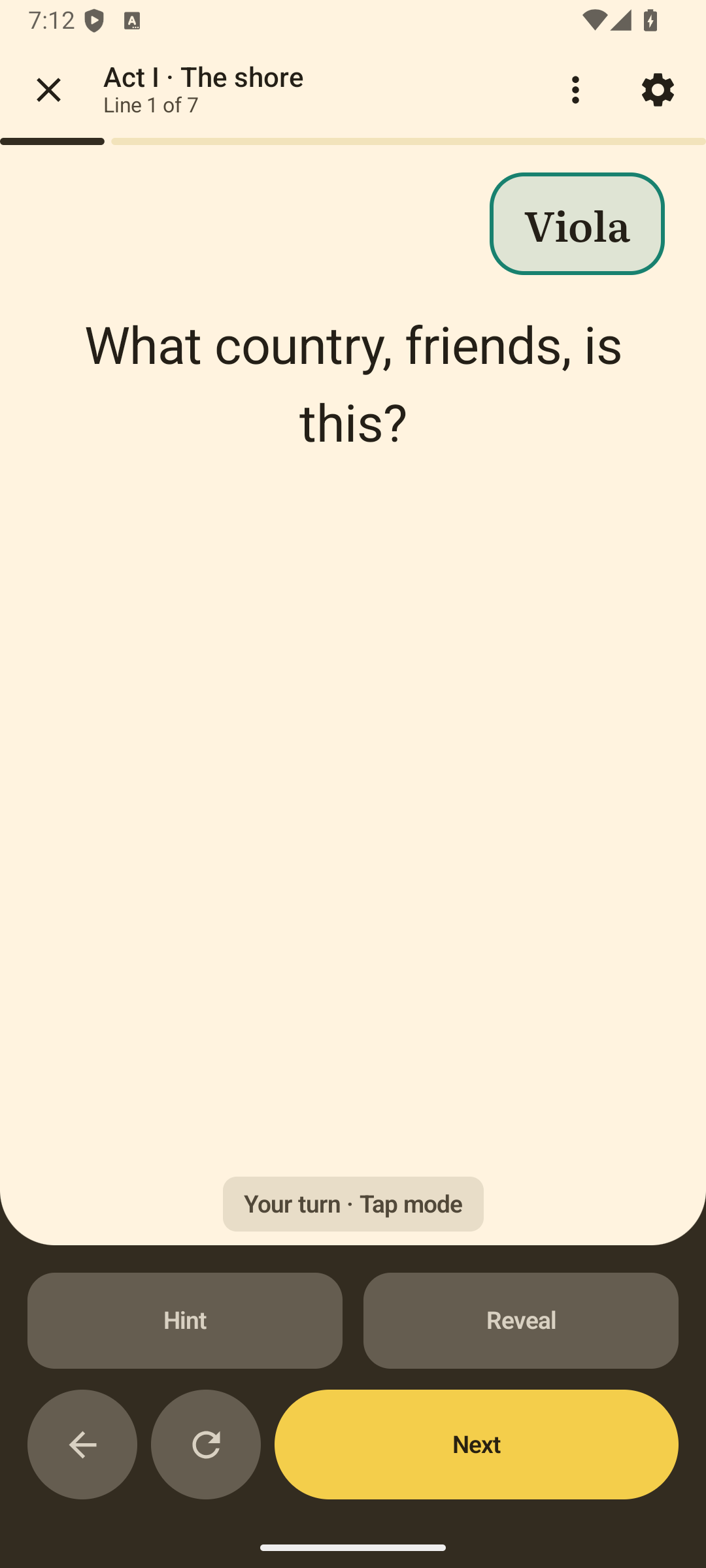
Layout 01
Angled phones
An app page with gently tilting phone frames, a short feature list and a screenshot gallery.
View layout 01Three proposed website layouts
The same app, three different ways to introduce it. Each uses the Off Book style guide, real screenshots and short, practical copy.
Layout 01
An app page with gently tilting phone frames, a short feature list and a screenshot gallery.
View layout 01Layout 02
An open, editorial layout. Three upright screens tell the story, with features underneath.
View layout 02Layout 03
A quieter ink-coloured page. Switch between three screens, then follow the simple setup steps.
View layout 03My starting pick: layout 01. It explains the app quickly and gives you the angled-phone treatment. Layout 02 is the cleanest option if you’d rather keep attention on the screens themselves.
The angled-phone layout with two possible app names.
Layout 01 uses lightweight CSS phone frames with gentle mouse-follow movement. The complete screenshots stay visible, at their original proportions. Each layout supports light and dark mode, keyboard controls and enlarged screenshots.